DPA Magazine
Just Two Colors

Just two colors. Experiment with composition of only two colors, occupying approximately half the picture area. Which one will dominate? Crop out all extraneous material. For close-ups of flat subjects, Make the lens axis perpendicular to the subject plane for maximum sharpness overall.
Water Reflections
Water reflections. The smoother the water, the better. The water will reflect the sky, and duplicate the color transitions there. Waves and ripples will change the reflections and bring color shifts into view. Use a graduated filter to bring the sky brightness down. Shoot before sunrise.
White Balance in Mixed Lighting

To create an image like this in a similarly lit situation: 1. Camera setting to daylight 2. Meter reading for the hot subject in foreground with a slight under exposure 3. The actual degrees Kelvin should determine the color of the main subject 4. White balance control was set to about 4000 degree kelvin which added a hint of coolness to areas not affected by the actual heat The technician′s silver reflective suit worked great to allow Ken to use reds as the hue for important composition elements. He tried using supplemental lighting as well but decided on going with the true available light. Exposure was delicate to control the intensity and richness of the "heat" - a key part of the story.
Think About a World Without Color
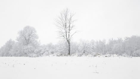
Oh for the days of black and white film. Well, even with digital color sensors you can still see in black and white (sort of). A good way to think about the use of color in your photographs is to think about the world without color. Try removing most of the color from your image, not in “Photoshop” but on location. A gray, foggy day will give you the sense of being without much color, as will some subjects like a subway station or a white tiled bathroom. Try looking and finding how much is out in the world that is predominately black, white & gray. Then try adding one primary color to you images. Shoot for a set time period looking for black, white, gray and then add either red, green or blue. These three are the primary additive colors from which all other colors are made. If you can learn to see them you can learn to use them in your compositions.
The Temperature of Light

Light has a temperature. The color characteristics of visible light are determined by its temperature. Without spending time on the physics, one can develop an intuitive understanding of the relative warmth or coolness of the light by thinking of the light source. On one end of the spectrum is candle light, which produces a very warm yellow – almost red tone. On the other is deep shade of the outdoors – which has a very cool or blue tone. In the middle is broad daylight. Your camera’s auto white balance setting will do a good job of determining what the color context of the scene you’re shooting is when there is something white in the picture frame – a cloud or the side of a white building. You’re better off manually setting the white balance (WB) to the icon that best describes your lighting circumstance when your image contains warm or cold toned subjects – a red fire engine, or a field of blue flowers. Often, if you’re shooting inside, you may have light from the outside streaming in through windows competing with the light from incandescent bulbs. In this case, getting an even color balance for your image can be a nightmare. If you’re looking to capture compelling colors without competing color casts, make sure you have light coming from only one source. Light from the window is creating a blue cast on the left side of the subjects face, while yellow light from an incandescent bulb is falling on the right side. For accurate color make sure you’re only using one light source, then tell your camera what kind of light you’re in by manually adjusting the white balance setting on your camera.
Subtle Color Transitions

Glass and metal buildings reflect the sky color around them. Shoot after sunset to get smooth and beautiful color shifts. Use a tripod and wait longer than you think is necessary. It could get better!
Photoshop Color Tip

Certain lighting conditions will desaturate the color of given scenes. This often happens in pictures taken on cloudy days. Sometimes the subject itself may not be vert colorful to begin with. Below is an example of how a photo of the San Francisco Bay Bridge was enhanced to give a little more punch. Here are the steps: 1) I chose a natural looking orange, representing sunlight, to cover the sky area with. This was chosen from the color swatch palette. In Photoshop, choose Window > Swatches. Drag your mouse over the color you wish to choose, then click. The selected color will show up at the bottom of the Tools window. 2) Near the bottom of the Tools window, click on the curved arrow by the color, so as to bring the selection of the background color forward. 3) Again, use your mouse to select another color from the swatches, perhaps an opposing one. I chose a bluish color to closely representing a natural sky. This second color should now also appear at the bottom of the Tool window. 4) Create a new layer in Photoshop above the original image. In the Photoshop menu, go to Layers > New. From the layers tab in the layers window, select the "Overlay" blend mode. 5) From the Tool menu, select the blend tool and be sure that the leftmost linear gradient of blend in selected above for that tool. 6) Now, drag your mouse from the top center of the image down and let go. You should see a gradient blend between the two colors. Try to get the middle of the blend to be positioned in a natural transformation point, like a horizon, for example. Drag your mouse again to try to get it right. There should be no need to erase or replace the layer. A longer drag will give you a smoother transition. 7) Adjust the opacity of the layer to give you a natural look. Too much opacity will look unreal. Again, be sure the layer containing the blend is in the "Overlay" mode to start with. 8) Try different blending angles, colors and different layer blend modes to see what works best for your image. Click the blend layer on and off to see the effect difference. 9) The last step is to flatten and save the image for sharing.
Color Toning for Mood

You can impart a lot of feeling into an image just by choosing the color palette in which you want to work. Blue can promote feelings of coolness, hipness, clarity and more rational thought. Reds, on the other hand, induce feelings of excitement and/or danger and bring on an adrenaline rush with thoughts of blood and violence. It’s no small surprise that red is the color of passion, intensity and excess. Greens are conducive to thoughts of earth and growth. As most living plants utilize chlorophyll (which is green) to synthesize energy, they take on it’s green color. It is natural to associate this color with growth, sun, water and life. By adding elements of a particular color to your photographs, you could be directing the viewer into an emotional realm you feel appropriate to your image. In these two images of bearded men, one has been tinted with a warm (yellow) tone and the other a cold (blue) tone. The emotional response to them is immediately obvious and distinctly different, illustrating the point that colors of a photo set, or at a minimum, enhance, the image’s emotional impact.
Color Ideas for Flowers

Color contrast. Let one color dominate the composition, then show a contrasting color for balance. With floral close-ups, soft light is often best, and shallow depth of field is OK if one interesting detail is sharp. Rain brings new opportunities. Flowers and leaves have more saturated colors when they are wet. A light mist can be wonderful. Big water droplets act like lenses. Bring an umbrella. Use color to highlight an area of interest. Color changes attract the eye to the differences. Place the secondary color away from the center of the composition. Close-up and tight cropping can intensify the effect.
Izzi Blu – A Study in Color Shifts

1. Using the camera′s color temperature for tungsten, the ambient daylight becomes blue in hue. This effect can be achieved with an on-camera flash by placing a tungsten gel on the flash head and changing your camera′s color temperature to tungsten or 3200 Kelvin. 2. Using a light balanced to tungsten gives the face a more natural color, though in this case I wanted the face to be warm and used a warmer gel to convert my key light. 3. The warmth of her face and the coolness of the environment helps to give the subject greater impact within the environment. 4. We also added a blue hair extension in her hair for style, and used neutral but warm colors in her outfit.
