June 2024, Great Architecture Photographers

June 2024, Great Architecture Photographers
Keeping you informed about happenings at Deliberate Light: photos to browse or buy, photography instruction (see also Digital Photo Academy), and services. Also, my thoughts on a photography subject: this month, Great Architecture Photographers. To get these newsletters by email a month before they are posted here, go to the DeliberateLight.com website and click on Newsletter Signup.
NEWS
Upcoming Workshops. I am scheduled to teach the following workshops in August.
August 3, location: 30th Street Station, Philadelphia.
· Mastering Your Camera Controls (1.5 hours) – DSLR/Mirrorless/Compact cameras (smartphone tutorial available separately)
· Composition in the Field (3 hours) – walking tour around the venue with instruction and hands-on practice composing photos (bring any camera)
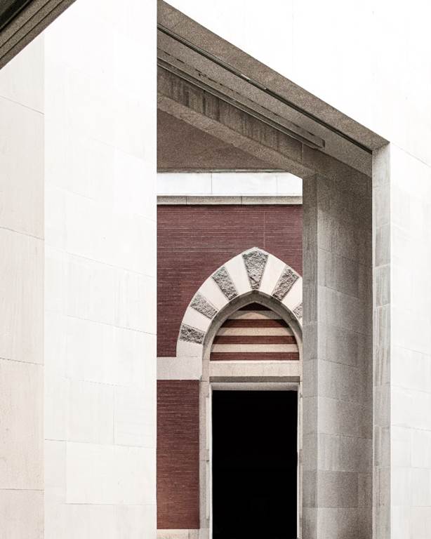
New Photo. Looking Through. The Lehman Wing in the Metropolitan Museum of New York is a visual feast of lines and angles and textures. With its mosque-like arches, it was a perfect venue for the Juan de Pareja exhibit, since he was born into slavery in southern Spain. Looking through a modern frame to glimpse an older architecture.
(New York City, NY, 2023)
For a more detailed, enlarged view and to get it printed, see it on my website.
VIEWS
Continuing with the architectural theme, it seems to me that buildings may be the fourth most photographed subjects on the internet, behind only pets, children and meals. Since you will likely take a picture of a building or related structure sometime in the next week, I thought you might like to examine the works of some great photographers.
To drive home the point that buildings have always been popular subjects, look at this picture of Paris taken in 1838 by the inventor of the Daguerreotype process, Louis Daguerre: Boulevard du Temple, Paris, 3rd arrondissement.
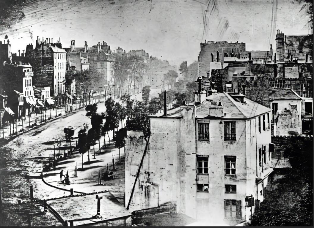
You might wonder why the streets are completely empty except for that one guy standing on the corner with his foot up. It is probably because Daguerre’s photography process required a long exposure blurring out any walking people or moving carts or horses to the point of disappearing, while the visible guy was probably standing still. While Daguerre had little choice, you can take advantage of this effect to make a busy street look nearly deserted: use an ND filter or some other way to make a long exposure (hard to do with cell phones, but not that difficult with regular cameras).
In this issue, I will not be reviewing any commercial architecture photographers. Make no mistake, they do extraordinarily good work, but they do not use equipment or techniques usable by the average picture taker. They bring very expensive cameras and lenses, lighting equipment and an entourage of assistants and then use Photoshop extensively to create dramatic and glossy images. If you have seen real-estate ads for expensive properties, you have seen their work. But I will not cover those photographers now because I want this to be accessible to an average photographer. Also, I think we can learn things from studying pictures by some historically great architecture photographers.
Berenice Abbott (1898 – 1991)
Abbott was best known for her cultural portraits, her images of New York City, and her scientific education photographs. As fascinating as it is to see Abbott attempting to visually portray quantum mechanics, we will look here at her New York City period which featured architecture. She was an early practitioner of a style of photography that tried to depict the reality of the subject being photographed, to communicate clearly its honest and objective nature. Called “straight photography”, it was a reaction to the (mainly) 19th century Pictorialists, who tried hard to make photography “painterly”. But lest you think straight photography was devoid of soul and artistry, consider the works by some of the other photographers in this movement: Alfred Stieglitz, Ansel Adams, Edward Weston, Dorothea Lange, and Imogen Cunningham, to name a few.
This photo is of Penn Station from the 30’s during its first incarnation. What can we learn from her compositional choices? First, her use of perspective distortion with the towering columns appearing to lean in, conveys a sense of the vastness of the space. In case you didn’t know, wide-angle lenses exaggerate perspective distortion. Second, by standing far from the concourse, instead of, say, in the middle of it, the viewer is separated from the people in the scene. Conversely, by choosing to shoot from the ground floor upward, she gives you the human point of view, whereas if she had climbed to the rafters for the shot, you would have had the birds-eye view which would have distanced you from the people even more. Draw your own conclusions about what this all means conceptually, but this is undeniably a striking photo because of her choices.
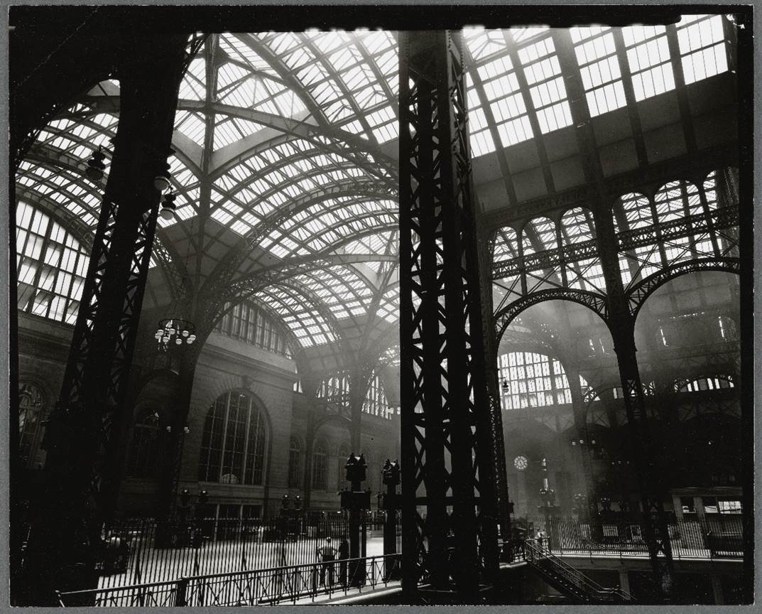
The Miriam and Ira D. Wallach Division of Art, Prints and Photographs: Photography Collection, The New York Public Library. (1930 – 1939). Penn. Station, Interior Retrieved from https://digitalcollections.nypl.org/items/20a89910-eb3c-013a-f80f-0242ac110003
Lucien Hervé (1910 – 2007)
Born in Hungary, Hervé had a very colorful life before settling in with photography. He studied art in Vienna, worked in fashion in Paris, joined the communist party and was expelled, was drafted into the French Army in WWII, was captured by the Nazis, joined the Resistance, rejoined the communist party and was expelled again. After the war, he began writing for art journals and it was on one such assignment in 1949 to do an article on a multi-unit housing development by the ground-breaking architect Le Corbusier, that Hervé catapulted into photography. He quickly formed a lifelong association for which he is best known, as Le Corbusier’s preferred photographer. However, he also worked extensively with other architects, institutes and publishing houses and exhibited very actively. His style was exceptionally artistic for photographs of buildings and he gravitated toward abstraction of building forms. His work features very sharp contrasts (perhaps due to the fact that he shot outside in sunlight frequently?) and inventive cropping.
What can we learn from this photo by Hervé of a Le Corbusier building in India? First of all, consider his usual approach to a building: wander through it, taking pictures of important parts of the building from multiple vantage points as you walk, and then assemble them into a sequence. From that sequence, he selected photos that told the best story of a walk through the building, also making it easy for Hervé to select individual photos for publication or exhibition. Second, do not necessarily fear the harsh shadows of mid-day. Hervé invariably produced high contrast photos like this one, with clearly defined spaces and let the shadows form abstractions. Third, find the natural frames in a building structure and highlight them. Fourth, frame people by the building – it humanizes the building.
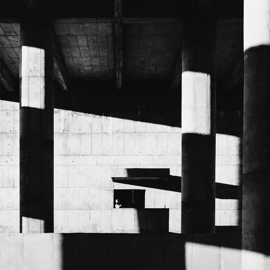
Secrétariat à Chandigarh (Lucien Hervé, 1955) Canadian Centre for Architecture, Montréal, Estate Lucien Hervé
Carol Highsmith (1946 – )
An extraordinarily prolific modern photographer, Highsmith has donated to the Library of Congress her entire photographic collection (nearly 100,000 images), it being one of the most viewed in the Library of Congress archives and freely available to the public. Besides her professional architectural photography, she has been deeply involved in numerous photographic projects on U.S. cities, states and regions, as well as books on important monuments, engineering marvels, historic renovations and civic landmarks covering all 50 states and the District of Columbia. Her mission in life is to record for future viewers what she calls “Disappearing America”, the places of everyday life, and not just celebrities and grand places of our time.
What can we learn from this rather commonplace view of cottages along a Cape Cod beach? The first thing that leaps out is her use of the repetition of the sameness of the cottages gradually receding into the distance along converging lines, perhaps intended to emphasize the magnitude of this human intrusion on nature. Second, the lack of horizontal symmetry here makes the picture feel unbalanced, as does the vast blue of the sky and the darkness on the right of the image. Perhaps Highsmith wants us to feel a bit uncomfortable with this view, further reinforcing that with the bland colors and flat tones of the houses in stark contrast to the vivid blue of the sky making them seem a bit dull and placid.
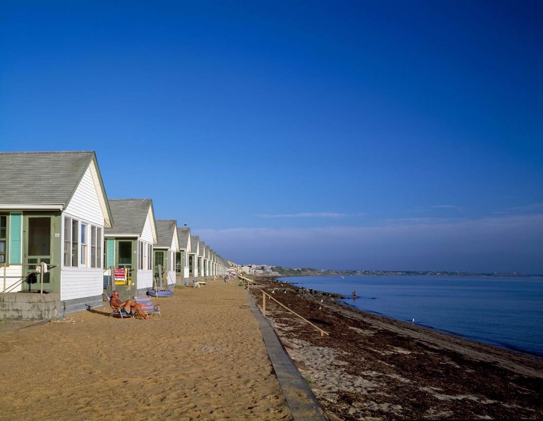
Truro Beach on Cape Cod (Carol Highsmith, between 1980 and 2006)
Carl Finkbeiner
Mobile: 610-551-3349 website instagram facebook linkedin digitalphotoacademy


