March 2023, Simplicity vs. Complexity
News & Views
from

March 2023, Simplicity vs. Complexity
Here is the second of my newsletters, keeping you informed about happenings at www.DeliberateLight.com. To get these newsletters by email a month before they are posted here, go to the DeliberateLight.com website and click on Newsletter Signup.
NEWS
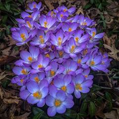
A new spring photo has been added to the Fine Art Gallery: the early crocuses from my long walks this year. For a more detailed, enlarged view, see it in the first gallery photo on my website.

And just so you know, when you click on a photo in the gallery, it enlarges to fill your screen. Plus, once enlarged, you can then click on the Buy Photo button to get the photo in any of a large variety of forms and price points, from digital downloads for wallpaper on your various devices or small prints or greeting cards for a few dollars, on up to large wall hangings.
VIEWS
My previous newsletter elicited some comments that the branches in the foreground of the Hudson River scene were a distraction. So, here for you to decide for yourself is that photo, followed by the photo with the branches digitally removed. (Click the < or > chevrons below the photo to switch between the two.)
What do you think? Does the first photo strike you as containing distracting clutter or as intriguing detail? Myself, I prefer the first photo, but it is surely a matter of taste.
Those comments reminded me about the concepts of “Simplification” and “Minimalism” as they apply in photography. In essence, the idea is that eliminating stuff from an image except its most essential element (elements?) makes for better art because all distractions from that element are removed. As with all rules, I believe this begs for nuance. A good case can be made for the visual rewards of complexity. Sometimes.
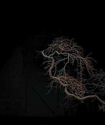
Minimizing too much in a photo can create a boring photo, the classic example (to me at least) is fenceposts standing up in a snow-covered field where everything besides the posts is white. While some people find such a photo appealing, I find it to be visually unrewarding, giving me nothing further after that first split-second view of it. But sometimes simplification allows you to focus on delightful details, for example, the elegant curls and twists in soft light of this tree branch can capture your attention because there is nothing else to distract your eye here. One could meditate, perhaps, with this ethereal image as a focal point.

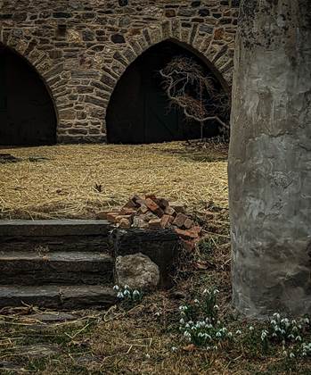
On the other hand, I actually prefer the complexity of the larger picture that this tree branch is embedded in. I like the richness of all the textures and lines and the little details.

Decide for yourself.
One last thought: by its very nature, simpler photos such as the lone tree branch tend to get more likes on Instagram. Complexity gets lost on a small screen viewed in the rush from one image to the next, while ironically, Instagram, taken as a whole, is itself an overwhelmingly cluttered medium.
Carl Finkbeiner
Mobile: 610-551-3349 website instagram facebook linkedin digitalphotoacademy


