July 2024, Berks Photographic Society Photos

July 2024, Berks Photographic Society Photos
Keeping you informed about happenings at Deliberate Light: photos to browse or buy, photography instruction (see also Digital Photo Academy), and services. Also, my thoughts on a photography subject: this month, Berks Photographic Society Photos. To get these newsletters by email a month before they are posted here, go to the DeliberateLight.com website and click on Newsletter Signup.
NEWS
Upcoming Workshops. I am scheduled to teach the following workshops on August 3 at 30th Street Station, Philadelphia. You can sign up here if interested.
· Mastering Your Camera Controls (1.5 hours) – DSLR/Mirrorless/Compact cameras (smartphone tutorial available separately)
· Composition in the Field (3 hours) – walking tour around the venue with instruction and hands-on practice composing photos (bring any camera)
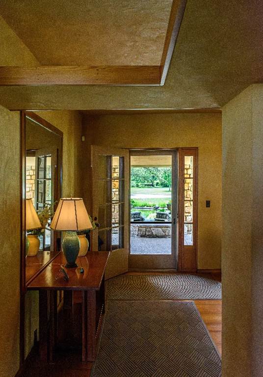
New Photo. Graycliff Entrance. Walking through a Frank Lloyd Wright house is always a treat. This one is Graycliff, a lake house built in 1927 for Isabelle Martin to complement Wright’s Martin House in Buffalo. Though it has wonderful lines, the entrance is deliberately small to encourage visitors to move farther into the house. It is a bit of a miracle that it was built at all, given that, at this time, Wright was losing Taliesin to bank foreclosure, getting divorced, and getting arrested for violating the Mann Act. Despite all that, it is a glorious house with a view of Canada across Lake Erie.
(Derby, NY, 2024)
For a more detailed, enlarged view and to get it printed, see it on my website.
VIEWS
Last month I spent a couple of weeks judging a photography competition sponsored by the Berks Photographic Society (BPS). BPS, established in 1938, provides both amateur and professional photographers opportunities to engage with other photographers through regular meetings and a variety of workshops, seminars and meetups. Twice a year, they host a competition for their members, and I was asked to judge the most recent one. 87 photos were submitted, from which I had to choose several winners. Unusually, I was also asked to provide a brief critique of each of the 87 entries to be delivered via a 90-minute Zoom call. I was very impressed with the quality of submissions, and I thought you might be interested in seeing the best in each of four categories, along with my comments.
General Photographers – Nature

Hosta Glory by Brett Hartkopp
My Comments. Beautiful use of both color and tonality contrasts in placing light colored elements against darker backgrounds, since the eye is drawn first to brighter parts of the image which here is the main subject. The use of depth-of-field to create a soft background blur further emphasizes the sharply focused subject, as do the little water droplets.. The transluscence created by seeing the light passing through the leaves adds a kind of delicacy here.
General Photographers – Pictorial
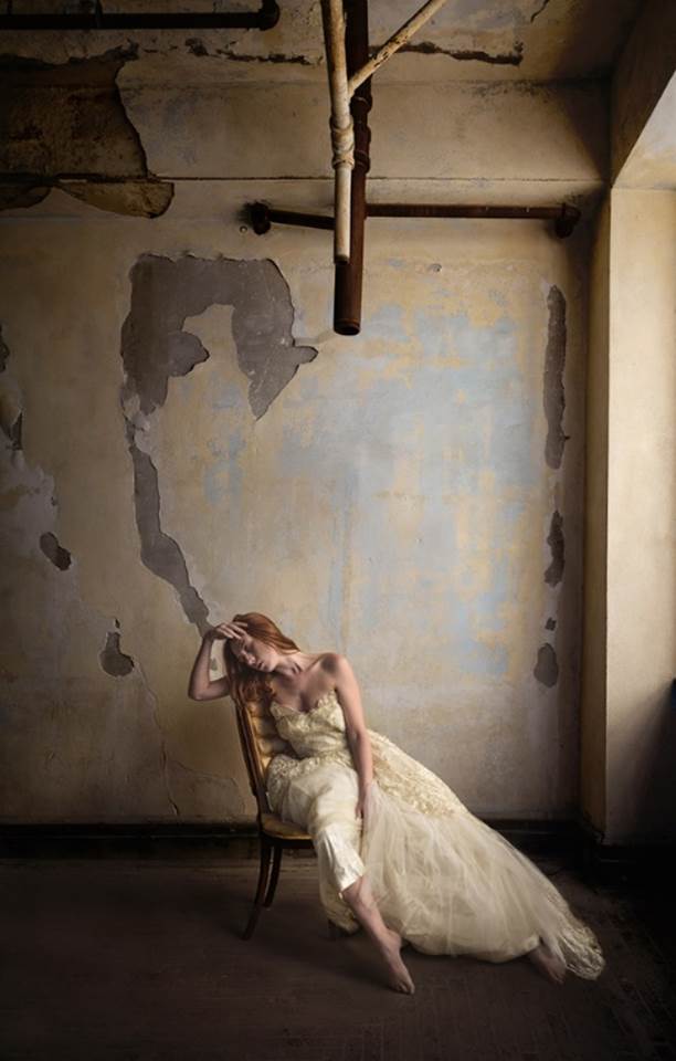
Almost Forgotten by Becky Carpenter
My Comments. There is so much right about this one as regards staging and lighting and composition. The soft window light falls off to pull your eye to the lady, who is aligned perpendicularly to the direction of the light. The light on the dress draws your eye to its details. This alignment means the lady has a brighter side and a darker side which gives her depth, in addition to the moody dramatic effect of the position. Your eye is then drawn from the lady up the curling patch on the wall which extends her line and also draws your attention finally to the perhaps threatening pipes hanging down from above and from there, back to the lady. This path of travel for the eye makes the image that much more interesting.
Advanced Photographers – Nature
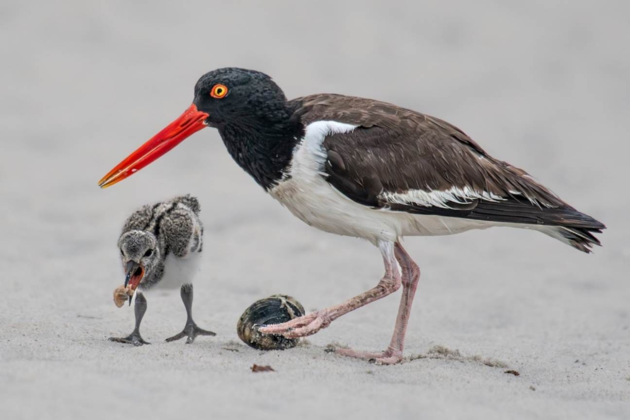
Oystercatcher with Chick by Deborah Lewinson
My Comments. This picture immediately invokes a little story in my head of a parent nurturing a child and I love photos that invoke stories. The first thing I notice is the minute details in the feathers and sand grains, because of the tack-sharp focus on the main subjects of this photo: the bird, the chick and the clam. This sharpness extends from the front of those subjects to the back, including that bit of food the chick is trying to eat, while the sand behind the subjects is blurred nicely to help you focus on the subjects. This happened because of excellent control of depth-of-field: everything that should be in-focus is and everything that is just unimportant background is not in focus. My only suggestion here is that the overall tone is a little flat and the high tones could use a little brightening. By I am quibbling.
Advanced Photographers – Pictorial
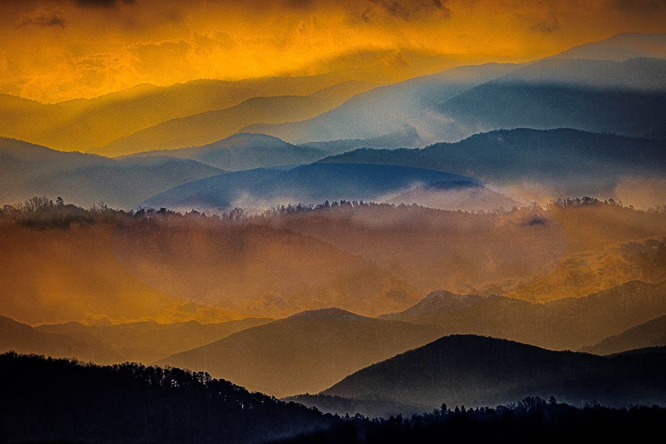
Smoky Mountain Dawn by Ellen Zimmerman
My Comments. I am a sucker for layers of mountains, especially the Smokies. The colors used to demark different layers are beautifully complementary, The use of light/dark shading enhances the layering impression. The little frilly tree lines on some of the ridge-tops adds interest in the details, and, of course the hint of mist and clouds adds to the fantastical quality. This was mostly composed in-camera, using a double exposure (to get the hint of trees in some of the layers) as well as a little horizontal in-camera movement to soften some layers. To top it off, graininess was added for further softness. No AI was used in creating this image. It was all created from photos taken by the photographer and manipulated directly by her. Plain and simple, it is art created by an artist.
Carl Finkbeiner
Mobile: 610-551-3349 website instagram facebook linkedin digitalphotoacademy


