DPA Magazine
Not for the Timid
© Michael Thoennes Emotion. Peak moment. Unique angles. Movement. Speed. Sports shooting is not for the timid. You must be actively engaged with your camera and think fast. Set your camera to shutter priority to stop the action. Use a higher ISO if needed to get a correct exposure. NIK software works wonders at removing the additional noise you′ll gain. The shot on the field was done with a 400mm 2.8 lens at f4 1/500. Most of us don′t have access to long fast lenses, so shots like this are rare for the average parent. But there are other opportunities on the sideline which can be captured with a normal or wide lens. Keep your eyes open for those moments and always look the other way!
Freeze the Action
© Robin Hill Shooting sports is almost always best if you can freeze the action. Try using a wide aperture and high shutter speed of at least 1/500 second. Sometimes showing the subject within the context of a wider frame can work well to tell the whole story. Try zooming out to obtain this effect.
Change your Point of View
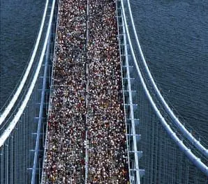
When photographing an athletic event or contest, normally one is focused on freezing the action. However, by changing your point of view, you will often notice patterns to the action that can be bold, graphic powerful, and revealing. In the two examples below, the elevated position radically changes the composition and content. © Adam Stoltman The shot of the New York Marathon was taken atop the Verrezano Narrows bridge and the perspective allows us to see the full size of the field entered in the race in a way that would be difficult at ground level. The overhead position allows us a perspective by which we can appreciate the size of the event with nearly 16,000 entrants in the race. © Adam Stoltman The tennis photograph taken at the US Open from the upper rows of the stadium, and interplay of light and shadow gives the viewer a sense of the lonely quest of athletic competition. The service motion -- even at a distance -- is frozen at the peak moment, when the action literally freezes itself for an instant. The point at which the ball is at the maximum height of the toss, and the server ready to uncoil.
Anticipate the Action
It was once said of Wayne Gretzky that he didn′t go to where to the puck was, he went to where it was going. By thinking ahead of the action, you′ll be ready for it. © Michael Hart In Craig Biggio′s final game, I pre-focused on second base whenever The Atlanta Braves got a runner on first; this way, as I kept the camera pointed to second but watched the action out of my left eye, I was ready to catch Craig turning the final double-play of his Hall of Fame career. As the runner neared second, I hit the motor drive and got the sequence, culminating in this shot of Craig airborne over the player, who is sliding in to attempt to break up the play. A long lens (300mm) and almost-wide-open aperture, with the resulting short shutter speed, freezes the action against a soft background.
John Bentham′s Still Life Webinar
On January 19th, 2010, DPA Instructor John Bentham presented and hour long webinar about Still Life Photography
Portable Lighting – Webinar Question
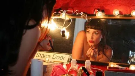
Brian, of Pottstown, PA asks: Q: What type of portable lighting might you recommend for wedding photographers? A: I don’t shoot many weddings but I often shoot documentary work with on-camera flash or fill flash. This is very much the same thing, in fact the prevailing popular style among wedding photographers is shooting with a documentary edge. I use dedicated on-camera flash units, that also have full manual over ride. You also need to invest in flash units that have full tilt, swivel capability, you are often utilizing this on location, bouncing the light off a wall instead of direct flash. If you spin the light completely around, and bounce it into the wall directly behind you, the bride is lit by a soft 8x10 foot light source (the wall) instead of a nasty little 2x3 inch very contrasty light (the flash unit). To power these I use Quantum external battery packs, specifically the Quantum 2x2. They are expensive but will power two flash units simultaneously, and are rugged, dependable and with the flash set on Auto TTL, the recycle time is VERY fast and battery capacity lasts all night (1000+ exposures on Auto). I own three of them, use them constantly, and have never had a problem with the batteries or the flash. At times I also incorporate a larger, more powerful, yet still portable lighting system on location. Lumedyne is a small, portable, battery and/or AC powered system, manufactured in Florida. The system is adaptable, expandable and powerful in relation to size. I know a number of wedding photographers who use this system. You can use it as I do, combined with on-camera flash, which syncs off the camera hot shoe and I trigger the Lumedyne lights with radio slaves (Pocket Wizard) plugged in to the PC sync connection on the camera body. This way you get the benefit of TTL up close to your subject with the Lumedyne filling in the shadows elsewhere in the room. Alternatively if you want an AC only powered system (more power, more reliable, fewer batteries to carry) I like Dynalite, and again a number of wedding photographer friends use these. They are light, small and still pack a punch. The point when shooting weddings is you need to be fast, portable and unobtrusive, your lights have to be the same. My photograph below, is from the Oct 27, 2009, Tricky Lighting Webinar. It shows an example of using on-camera and off-camera flash mixed with the available ambient light (existing light). John Bentham is know for subtly mixing ambient light with supplemental fill flash. A tricky technique to master it requires a delicate touch with the flash, just enough to lighten the shadows to make a photo legible, but not so much that the photograph appears over lit. John has learned how to put his subjects at ease, to let them be themselves, and to be patient until the personality of the subject is revealed. His photograph above of Burlesque and Cabaret performer, Veronica Varlow, is a striking example of this style of shooting. © John Bentham Digital Photo Academy and LivinginHD present a free monthly series of photography webinars on LivinginHD.com. Your host, John Bentham answers many questions live during the webinars. Additional questions and answers are posted here on digitalphotoacademy.com. You can also view the archived webinars for reference. View the Oct 27, 2009, Tricky Lighting Webinar here: http://www.digitalphotoacademy.com/Home/UserArticleCategories/UserArticles/details/params/object/9166/default.aspx
Nature Just Before Dark – Webinar Question
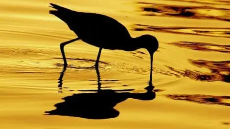
Samantha from Sedona, AZ asks: Q: I′m interested in capturing wild pigs. They often come out just before dark and, of course, they won′t stand still. Do you have setting suggestions? A: It depends on your shooting style and the objective. A lot of nature and wildlife photographers use, camera blinds which are similar to shelters, blinds, tree chairs etc used by hunters. An alternative is to set up camera(s) with flash on tripods rigged with trip shutters (motion or sound sensors shutters). The problem here obviously is you can frame the photo by setting the camera position, but you cant predict exactly where the animals will go, or where it might appear in the frame (if at all). Typically you only get one or two frames before the animals are spooked by the flash. At dusk, if its bright enough to shoot without flash, you may get off a few shots using a remote shutter release (Pocket Wizard). The best case scenario is a fast lens with a wide aperture (f 2.8, or f1.4).This will enable you to shoot in less light and with a higher shutter speed. With a lens that has a working aperture of at least f2.8 you can shoot in much lower light than with a “kit” lens (the lens that comes packaged with most DSLR cameras). The faster aperture will enable you to shoot with a shutter speed of approx 1/60 second at dusk by raising your ISO to 800, and then up to 1600 when it starts to get darker. Unless you’re using trip shutters, or remote shutters and shooting from a blind, you still have the issue of spooking the animals. Then your best bet is a bit of camouflage (primarily finding a concealed position) and a long fast lens. Set yourself up in an area where you have seen the pigs before, or can see their recent tracks. Then using a longer lens you should be able to shoot without disturbing the pigs. This will keep them from moving as much and the long lens has the added benefit of diminishing the movement of the pigs. IE: If you are 5 feet away from a moving object it is much more difficult to keep the object in frame and focus, than if you are 200 feet away shooting with a long lens. I would suggest a tripod for the long lens as you tend to get some camera shake at that distance. An IS or VR lens will help with this but only on the camera end. IS does NOT eliminate movement of the subject, only at the camera and lens. The focal length of the lens will depend on how close you are to the animals and how large you want them to appear in frame. You can determine this by a little trial and error in daylight before shooting the animals. Set up your long fast lens and point it at a pig sized object (a Bar-B-Que?). This will determine the ideal distance between you and the pigs, to get the images you want. The photograph below gives an example of a nature photograph using a very long lens so as not to disturb or spook the bird. The photographer, Russ Burden, a DPA instructor in Denver, has used a 360mm lens (540mm - 35mm equivalent) to achieve this. © Russ Burden Russ Burden has a great deal of experience leading nature workshops, (RUSS BURDEN NATURE WORKSHOP SHOULD BE LINKED HERE). This is very evident in his photograph of the bird above. The stature of the bird, the intense color, the ripples in the water, these all indicate forethought in the photograph. By photographing the bird against the bright saturated yellow water Russ has reduced the photograph to two very intense components. By making the photo simple, he has added layers of complexity and created a stunning icon for wildlife photography. Digital Photo Academy and LivinginHD present a free monthly series of photography webinars on LivinginHD.com. Your host, John Bentham answers many questions live during the webinars. Additional questions and answers are posted here on digitalphotoacademy.com. You can also view the archived webinars for reference. View the Oct 27, 2009, Tricky Lighting Webinar here: http://www.digitalphotoacademy.com/Home/UserArticleCategories/UserArticles/details/params/object/9166/default.aspx
Study Your Surroundings
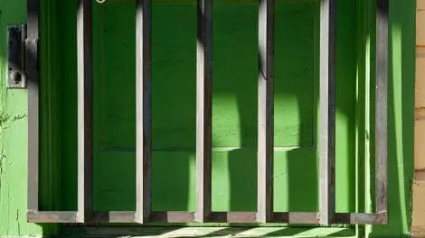
© Allen Birnbach Study the commonplace and look for the extraordinary in your normal surroundings. I was walking through an outdoor museum, and saw this doorway. Certainly the vibrant color caught my eye. And the strong geometric shapes from the iron gate added a wonderful repeating pattern. But what else was going to make this a make this a image worth shooting? What about the touch of color in the wood wall and how it created tension with the dominant green of the door? Or the small piece of white wire hanging off the door lock, just out of site at the top left of the image? Using the white wire adds new curving shapes to a straight line world, and showing just a small amount of it balances the yellow wood on the right. So when you are out shooting, look for patterns that can add a strong graphic image and still give you opportunities to incorporate unexpected and delightful elements.
Patterns Calibrated
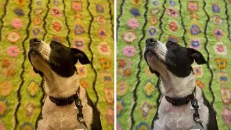
Real Life Applications of the Datacolor Spyder 3 Elite Monitor Color Calibration System and the Spyder Cube Color Management tool. “Color is the place where our brain and the universe meet.” Paul Klee When we entered ABC Carpet, the design furnishings super store at Broadway and 19th Street in Manhattan, we immediately encountered the hot pink signage, (hot pink looked more orange without the color management adjustment as shown above.) that featured a statement reflective of Paul Klee′s devotion to color. As it turned out, the editorial assignment photographing brightly colored carpets and furniture was perfect to exemplify the need and precision of the Cube and Studio Management system. After the shoot we imagined Klee probably would have somehow incorporated the Spyder Studio in his work had it existed when he painted in the last century. The magazine editor even thought adding in the lovable black and white pooch was a nice whimsical touch. Spyder 3 Elite Monitor Color Calibration In many cases I’m shooting in underground nightclubs, biker bars or dimly lit locations punctuated by bright stage lights with garish colored lighting gels, and in such situations the harsh and distinctive “off” colors represent a significant and intentional element of the image. Even when the colors are "off," accurate post production color management is crucial to accurately recreate those "off" colors. What existed in the scene, and what is captured by the camera, and what is displayed on your computer monitor are very often not the the same thing. In the past whenever color corrections were necessary I usually left that up to my digital technician to complete in concert with the art director or client. This often resulted in considerable expense, $500+ per day, in addition to inconvenient time delays and complications for important clients. Over the past few years the industry has undergone significant changes, in workflow, economics and expectations. In the past photographers shot the film, developed it and sent it to the client. Now clients expect photographers to submitted color corrected, retouched and ready to print images, which means more is expected for the same money. For any one day of shooting I can now count on an additional one to two days of image processing with lower or nonexistent budgets for digital technicians. What this means for the photographer is to stay competitive you need to do the digital processing faster, easier and in many cases do it yourself. This is where the Datacolor system comes into play. I recently moved studios, from Tribeca to the West Village, in Manhattan. My office in the old studio was in the back of the building, away from any direct light and great for image processing, retouching and color correction. Throughout the day, and even at night, lighting conditions didn’t change much, thus I didn’t worry much about ambient light levels, fluctuations in color balance and color shifts when image processing. My new office, although much brighter and with a better view, is a terror with regard to color calibration and color management. I have a south facing window and depending on the time of day and the weather, I get a vast array of light warm or cool light, diffuse light or direct sun. I also now must contend with Tungsten streetlights shining through the windows whenever I’m doing image processing at night. The light in my office is constantly changing and proving to be an issue when doing color correction work. I use Mac computers, Cinema Display and iMac monitors in addition to a Powerbook. For my initial monitor calibrations I intentionally calibrated in less than ideal (read bad) lighting conditions, just to see what the software and device were capable of. I set up the computers near the window and calibrated on an overcast day, and again the following day in direct sunlight. Once I loaded the software it ran easily and quickly without any of the expected baby-sitting required. Now, whenever I re-calibrate, I just set it to run and during those few minutes I work on something else. The Spyder Elite 3 software and equipment includes an ambient light measurement tool which has proved very useful in this situation. The software incorporates a desktop warning light icon. The icon helpfully changes from Black to Yellow to Red depending on your status. Using this feature I was able to see just how often the ambient light level changes, which proved to be every 20 minutes, with a significant shift every hour. Based on these fluctuations, and since its impractical to do a recalibration every 1/2 hour, the most workable solution is to do a recalibration immediately before I do any Color Management work. This way I’m sure the monitor is calibrated properly and I’ve got a window of an hour or so before I need to recalibrate. (L) Original, uncorrected Image (R) Color Corrected Image During the Editorial assignment shoot, I ran the Cube through trials on various floors and locations within ABC Carpet, at times close to large windows, sometimes deeper towards the interior of the building, under high ceilings as well as squeezed into corners with lower ceilings. We moved continuously throughout the store, resulting in different light sources, color balances and exposures. The idea for the European Design magazine article was to have a goofy looking and distinctly non-designer dog sitting amongst the designer and vintage furniture. Thus we had a perfect situation to test the cube, a dark black, a bright white and numerous colors in between. The dog was very cooperative but it turned out the easiest way to shoot was just to hang the cube from the dogs collar. With lighting conditions changing so often, we shot with the understanding we could always call up a corrected white balance and would simply retouch the Cube out of the final selects. For interior designers, architects and the furniture manufacturers themselves the exact and proprietary colors they utilize are very important to the work they do. Obviously the color balance needs to be correct. Some examples below show obvious differences in color or hue while in other examples the differences are more subtle, either way it is important for the colors to be completely accurate. Spyder Cube Recently I had a number of photo shoots where I tested the practicality and functionality of the Spyder Cube in real world scenarios. My aim was to capture a variety of appropriate examples showing the importance of color management. I shoot many different assignments, most on location and often in challenging lighting conditions. I am regularly blending and supplementing existing ambient light with on-camera flash, and in many cases also using a larger location flash kit, also mixed with ambient. My biggest challenge in many situations is the variety of light sources which result in a mixed and often incorrect white balance. Practically speaking most digital cameras are not very accurate when capturing color in the Auto White Balance mode, and of course the color only applies to the Jpeg images processed in-camera. To process RAW images properly one must utilize some standards for color. Often photographers would resort to using a white shirt or a black jacket as color samples but that method has serious drawbacks, consistency being the largest issue. In the past I have utilized a variety of color correction and color measurement tools including the old standard 18% cardboard gray cards, small gray scale paper strips (Black, Gray, White), a Pop-Up Fabric color chart, and more recently a rather expensive, very small and somewhat disappointing color corrected card. There are numerous situations where a tool like the Spyder Cube proves extremely helpful. For example, in addition to my documentary work I regularly shoot corporate portraits for three large international law firms. I’m called in every couple months to photograph new attorneys, or update photos for existing employees. The photos are used for press releases, web sites and annual reports. The lighting set up is relatively straight forward, nothing fancy, but it’s important that each new batch of photos, from each law firm, match the existing photographs. To further complicate the issue there are five other photographers shooting attorney portraits in other cities. As you can imagine with six photographers, shooting in different locations, with different lighting and camera systems the results could be all over the map. The only way to maintain consistency is to include an exposure and white balance calibration tool in the test frames. The system works relatively well but once in a while we get thrown a curve. A few months ago I was photographing an attorney who had an eye condition that prohibited the use of flash. I had to mimic the studio lighting with window light and reflectors. With a little trial and error I was able to match the lighting and exposure but the color balance was significantly different. We were using paper gray cards at the time but I always find them rather flimsy, the exposure changes dramatically depending on how they are angled towards the light. I like the three dimensional design of the cube for an accurate color balance and exposure, especially when attempting to match results. One of my assistants would carry around one of the paper exposure cards in his wallet, every time he fished it out you could see the thing had aged. Being intended as a one-use product the paper color tools just don’t compare to the solid durability of the Cube I use now. During one of my recent Digital Photo Academy advanced workshops we photographed a professional model/Burlesque dancer while testing the Spyder Cube. Photographed at the DPA Manhattan studio we were primarily using natural light coming through large windows, mixed with Tungsten light (model lights in the strobe heads), in addition to the overhead Halogen room lights. Mixed light is always an issue for digital cameras, as it was in the past when shooting transparency film. One of the lessons of the workshop was managing color balance when shooting mixed light, finding a balance between the cool daylight and warm studio lights. The Cube proved very helpful during the post capture critique as an exposure and color benchmark. (L) Original, uncorrected Image (C) Color Corrected Image (R) Re-touched Image The Spyder Cube is durable and a practical size, being small enough to fit in a pocket yet large enough to read in a photograph. I’ve already got the thing soaking wet taking photos of my son Luke playing in the kitchen sink, and he thought is was a pretty fun toy. Obviously you couldn’t do that with any of the paper charts out there. The kitchen is fluorescent light mixed with daylight. To further complicate matters the kitchen has blue curtains and the walls are painted off-white throwing the color balance further off target. I usually end up shooting a custom white balance but the Cube handled the situation perfectly. I used the Cube for color correction, setting a corrected White Balance in Adobe Camera Raw. I simply followed the method outlined in the Datacolor online video, using the eye dropper tool and clicking on the brightest gray face of the Cube (which indicates the strongest light source). When processing subsequent images (batch processing), it’s very easy to create a preset color calibration using the Cube in Adobe Camera RAW, once you’ve established your preset you simply apply the color correction to other images. Some color shifts are subtle but still easily discernable by the professional eye of a photographer, art director or client. Such instances only require slight color correction, primarily in the whites and skin tones, while in other photographs there are glaringly obvious color shifts. The Auto White Balance systems of most cameras are fooled by mixed light sources, and the various bright colors predominating a scene. Since I shoot a number of editorial and advertising portraits, the ability to capture correct and pleasing skin tones represents a large part of my work and the subsequent color management. The Datacolor system ensures the art director and client are looking at the same photograph I’m looking at. Note: Photo samples above show original, uncorrected image (Left) , and color corrected and re-touched images (Right). Photos were shot using Canon and Panasonic cameras. Color corrections were made on RAW images using Adobe Camera RAW, or in a few cases on Jpegs processed in-camera then corrected in post with Adobe Camera Raw. All photographs copyright John Bentham 2009.
Observation is Key
© Russ Burden Becoming an observer of patterns certainly played a huge role in acquiring the image of thecottonwood catkin. There’s a city park about 50 minutes from my home where fox frequent. I made a pre-sunrise trip to capture them in early light. The only problem was the foxes never revealed themselves. Rather than throwing in the towel, while I continued to look for a sign of a fox, I also opened my eyes to other options. As it was springtime, the cottonwoods in the area were beginning to bud. Out of curiosity, I approached a low hanging limb and a world of patterns and color opened up. The observer in me proved to be beneficial in finding a nice pattern in nature.

