DPA Magazine
The Temperature of Light

Light has a temperature. The color characteristics of visible light are determined by its temperature. Without spending time on the physics, one can develop an intuitive understanding of the relative warmth or coolness of the light by thinking of the light source. On one end of the spectrum is candle light, which produces a very warm yellow – almost red tone. On the other is deep shade of the outdoors – which has a very cool or blue tone. In the middle is broad daylight. Your camera’s auto white balance setting will do a good job of determining what the color context of the scene you’re shooting is when there is something white in the picture frame – a cloud or the side of a white building. You’re better off manually setting the white balance (WB) to the icon that best describes your lighting circumstance when your image contains warm or cold toned subjects – a red fire engine, or a field of blue flowers. Often, if you’re shooting inside, you may have light from the outside streaming in through windows competing with the light from incandescent bulbs. In this case, getting an even color balance for your image can be a nightmare. If you’re looking to capture compelling colors without competing color casts, make sure you have light coming from only one source. Light from the window is creating a blue cast on the left side of the subjects face, while yellow light from an incandescent bulb is falling on the right side. For accurate color make sure you’re only using one light source, then tell your camera what kind of light you’re in by manually adjusting the white balance setting on your camera.
Subtle Color Transitions

Glass and metal buildings reflect the sky color around them. Shoot after sunset to get smooth and beautiful color shifts. Use a tripod and wait longer than you think is necessary. It could get better!
Photoshop Color Tip

Certain lighting conditions will desaturate the color of given scenes. This often happens in pictures taken on cloudy days. Sometimes the subject itself may not be vert colorful to begin with. Below is an example of how a photo of the San Francisco Bay Bridge was enhanced to give a little more punch. Here are the steps: 1) I chose a natural looking orange, representing sunlight, to cover the sky area with. This was chosen from the color swatch palette. In Photoshop, choose Window > Swatches. Drag your mouse over the color you wish to choose, then click. The selected color will show up at the bottom of the Tools window. 2) Near the bottom of the Tools window, click on the curved arrow by the color, so as to bring the selection of the background color forward. 3) Again, use your mouse to select another color from the swatches, perhaps an opposing one. I chose a bluish color to closely representing a natural sky. This second color should now also appear at the bottom of the Tool window. 4) Create a new layer in Photoshop above the original image. In the Photoshop menu, go to Layers > New. From the layers tab in the layers window, select the "Overlay" blend mode. 5) From the Tool menu, select the blend tool and be sure that the leftmost linear gradient of blend in selected above for that tool. 6) Now, drag your mouse from the top center of the image down and let go. You should see a gradient blend between the two colors. Try to get the middle of the blend to be positioned in a natural transformation point, like a horizon, for example. Drag your mouse again to try to get it right. There should be no need to erase or replace the layer. A longer drag will give you a smoother transition. 7) Adjust the opacity of the layer to give you a natural look. Too much opacity will look unreal. Again, be sure the layer containing the blend is in the "Overlay" mode to start with. 8) Try different blending angles, colors and different layer blend modes to see what works best for your image. Click the blend layer on and off to see the effect difference. 9) The last step is to flatten and save the image for sharing.
Color Toning for Mood

You can impart a lot of feeling into an image just by choosing the color palette in which you want to work. Blue can promote feelings of coolness, hipness, clarity and more rational thought. Reds, on the other hand, induce feelings of excitement and/or danger and bring on an adrenaline rush with thoughts of blood and violence. It’s no small surprise that red is the color of passion, intensity and excess. Greens are conducive to thoughts of earth and growth. As most living plants utilize chlorophyll (which is green) to synthesize energy, they take on it’s green color. It is natural to associate this color with growth, sun, water and life. By adding elements of a particular color to your photographs, you could be directing the viewer into an emotional realm you feel appropriate to your image. In these two images of bearded men, one has been tinted with a warm (yellow) tone and the other a cold (blue) tone. The emotional response to them is immediately obvious and distinctly different, illustrating the point that colors of a photo set, or at a minimum, enhance, the image’s emotional impact.
Color Ideas for Flowers

Color contrast. Let one color dominate the composition, then show a contrasting color for balance. With floral close-ups, soft light is often best, and shallow depth of field is OK if one interesting detail is sharp. Rain brings new opportunities. Flowers and leaves have more saturated colors when they are wet. A light mist can be wonderful. Big water droplets act like lenses. Bring an umbrella. Use color to highlight an area of interest. Color changes attract the eye to the differences. Place the secondary color away from the center of the composition. Close-up and tight cropping can intensify the effect.
Izzi Blu – A Study in Color Shifts

1. Using the camera′s color temperature for tungsten, the ambient daylight becomes blue in hue. This effect can be achieved with an on-camera flash by placing a tungsten gel on the flash head and changing your camera′s color temperature to tungsten or 3200 Kelvin. 2. Using a light balanced to tungsten gives the face a more natural color, though in this case I wanted the face to be warm and used a warmer gel to convert my key light. 3. The warmth of her face and the coolness of the environment helps to give the subject greater impact within the environment. 4. We also added a blue hair extension in her hair for style, and used neutral but warm colors in her outfit.
Feelin′ Blue – Pick a Color

Feelin′ Blue - Pick a Color by Russ Burden Color can be a very powerful graphic element in a photograph. Red, orange and yellow tones evoke a feeling of warmth while blue, green, and purple are cool and refreshing. Warm tones are often more striking and seem to pop off the page while cool ones recede and are more subdued. Color can be responsible for the mood of a photograph so depending on what you want to portray, the proper choice of color is important. The more pronounced a specific color is, the more it will impact the feel of the image. Too much color can overwhelm the viewer. It’s better to isolate a certain color or just have a single colored element in the composition to draw the viewer’s attention. This is what brings me to the premise of this article - the color challenge. Challenge yourself wherein you pick a color and concentrate on it for a day, week, month, or simply make it an ongoing theme. Every time you pick up a camera, look for subjects that portray the color. But go beyond basic capture just taking a picture with color. Make sure you stick to all the photographic concepts of good photography. Lighting, composition, depth of field, shutter speed, etc. all need to be addressed to make viewers want to study the finished theme of pictures. Simply having pictures with, for instance, red items, doesn′t mean you’ve accomplished what you set out to do. Depending on the color you choose, lighting will have a big impact on the success of the photographs. Early and late sunlight enhance warm tones and give them a very saturated look. It also tends to remove some of the coldness of blues and greens. This may be the effect you desire. Experiment and shoot in all different kinds of light. Something unexpected may surprise you in a good way. Don’t overlook different sources of artificial light. Direct flash gives a hard look while a diffuser placed in front of one softens its light and wraps around what you photograph reducing the contrast. Tungsten light used with daylight film gives an orange cast. Tungsten film shot outdoors gives a blue cast. If you’re shooting digitally, play with the white balance settings in the camera or shoot in RAW and experiment with the white balance in camera raw. With regards to composition, be cognizant of how colors play against each other. Are they too close, too far away, touch an edge and bleed off the image, too much, or too little? As you compose the image, study the entire viewfinder to make sure the above pieces fit into place. In the accompanying images I played around with the color blue. No set reason as to why I chose this color. You may pick a tone as it’s your favorite or simply pick one out of a hat. It may be a great idea for your camera club to do something like this as a theme for a monthly competition. To learn more about this topic, join me on one of my Photographic Nature Tours. Visit www.russburdenphotography.com and click on the NATURE TOURS button for more information. Also, pick up a copy of my new book, Amphoto’s Complete Book of Photography. You can purchase a signed copy directly from me or visit your local book store or Amazon. Contact me at rburden@ecentral.com to order your signed copy.
Eye Popping Color
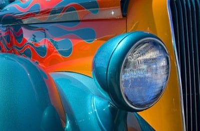
The strategic use of color allows a photographer to create compelling images. Using eye popping color to draw a viewer into a photograph is one way to achieve this. It can be used as a design element, a way to grab attention, to show comparison and contrast, and even as a main subject. As a design element it’s wise to keep the composition clean and simple. Color can easily be used to grab a viewer’s attention especially when it’s bold and vibrant. When used to contrast or compare, it’s essential to be cognizant of the colors that are included. When used as a main subject, patterns, textures and abstracts come to mind. How you choose to incorporate all the above into an image dictates the outcome of the image. Scenes with contrasting color makes the viewer of a photo move back and forth from one object to the other. If the objects are connected, side by side, or right next to each other, each will compete for attention. Careful choice of what to include in the image is essential as it’s not wise to have opposing subjects compete for attention. Look for situations where one of the objects is much closer to the front of the frame as it will become the dominant element. Another good strategy is to look for elements that show a large variation in size. When a large, boldly colored object is compared to a small boldly colored object, the large one usually wins the battle for attention. So how does a photographer achieve eye popping color? One way is to shoot at the times of day when color saturation can be maximized. The magic hours of sunrise and sunset allow this to occur. At these times, the warm colors caused by pollution, dust, and particulates that hover near the horizon create a golden hue that provides richness and warmth even in the colder tones of blue, green and purple. Avoid shooting in the middle of the day as the cool tones caused by strong blue skies robs color saturation. If you have to shoot during this time, try to get in the shade or work on overcast days. The reason color is more enhanced when it’s overcast is the glare that is cast on all objects on a sunny day subdues the color. Fall foliage is proof of the above. Try using a polarizer to minimize glare if you have to shoot in sunny conditions. Photoshop CS3 and Elements include a wonderful tool called Hue/Saturation. I’m sure the majority of readers of this article are familiar with its use but for those of you who may not know of its existence, I encourage you to rush to your computer when you’re finished reading and play with it. Activate it by going to Image / Adjustments / Hue Saturation. A box appears with three sliders. The one you need to go to is Saturation. As you slide it to the right, the color saturation is quickly enhanced. I strongly urge you to use it conservatively unless you want to go through what myself, and many other photographers new to this tool went through. I had to redo most of the files I originally worked on in that I over increased the saturation because I could and, at the time, I thought it looked great. Be aware - just because you can doesn’t mean you should. To learn more about this topic, join me on one of my Photographic Nature Tours. Visit www.russburdenphotography.com and click on the NATURE TOURS button for more information. Also, pick up a copy of my new book, Amphoto’s Complete Book of Photography. You can purchase a signed copy directly from me or visit your local book store or Amazon. Contact me at rburden@ecentral.com to order your signed copy.
Red Square, Moscow
While visiting Moscow, Russia, I wanted to create a photograph that said "Red Square" and noticed this dark metal sculpture at the entrance to one side of the square. To capture a photo with similar impact, here are some suggestions: 1. Wait until the sun is very low and bright on the horizon 2. Set the color temperature on camera to Auto White Balance (AWB) 3. Slight under-exposure in the camera, minus 1/2 or 1 stop 4. Increase saturation by 25% on the in-camera menu 5. Slight cropping in Photoshop, if needed
You Never Know!
My mother taught me to never leave the house without keys, money, and clean underwear. “You never know . . .” I’ll add one more essential to that list. A CAMERA. It was a chance happening photo-op during the intermission of the Merce Cunningham Dance Company′s opening night--just outside of the Minskoff Theater, NYC - January 1980. I am certainly not a ballet buff. But my former wife was, and Barbara, my sister-in-law had tickets—I didn’t have much choice. So there I was. The silver lining: Barbara leaned over and said “That’s John Lennon.” I immediately thought of the Kremlin’s frozen coffin. Barbara had a way of putting people on, so with an attitude of total disbelief and sarcasm, I turned around and said “Where?” Not recognizing the back of his head, she practically pushed me in front of him and told me to take his picture. “Gulp!” I am not a paparazzi, and probably never will be. But I said Oh! What the heck. Embarrassment goes away in time. So I got up the nerve and got off two frames, before I got polite and asked permission. He was deep in heated conversation with Robert Rauschenberg, who designed the sets for the ballet performance. Neither objected to my photography, but politely declined to pose. John went back into the theater with Yoko, and Robert Rauschenberg went back to his argument with Louise Nevelson. I went back into the theater wondering how much intensifier I would need to get a decent negative from this way under-exposed Tri-X film. As it turned out, I managed to get a good candid and serious mood shot of a person whom I consider to be the greatest and most influential musician of our time. It is a print that I’m proud to hang on the gallery wall of my home. ~ Milton Heiberg www.miltonheiberg.com
